Below is the current logo for the YO! sushi brand

Just by looking at the logo for YO! Sushi sets the style choice for what the mural may need to look like. As it’s really bright, vibrant and modern, I’m thinking of incorporating the brightness into the mural, so it looks as though it belongs to the YO! Sushi brand.
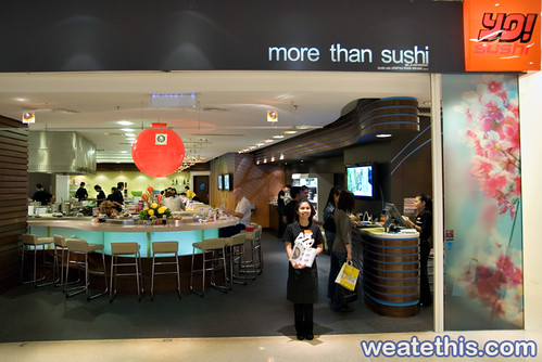
The colours from the logo also follow through to the interior of the YO! Sushi restaurant. (as you can see from the image above) Which in turn reinforces the brand, but also keeps the corporate feel of the company throughout all aspects of their identity.

I also decided to look at how the food is served, as it isn’t the traditional way of being served in a typical posh restaurant. It’s self service, where in which you choose what you want to eat from the coloured plates that come around on a conveyer belt.
This in itself makes the whole YO! sushi brand unique and memorable, because it has a more hands on approach to how to choose what courses you want to eat. It also makes it more fun and interactive because the plates are different colours, therefore you wait for your chance to take the coloured plate of your choice when it comes round on the conveyer belt.
The bill for the food eaten runs a unique system. Each plate is colour coded to determine the price of each plate. The numbers of plates used by the customer are then totalled to create the bill.

These specific plates also portray the brands corporate colours, however they do include other colours as they have a large menu. So four different colours couldn’t cater for all the item groups on the menu.
I personally think this sort of dining is the way forward, it’s ultra modern and is exciting experience at the same time.
Therefore what ever I produce for my mural has to reflect all the aspects I have just mentioned, so it fits in with the dining experience and the uniqueness of the YO! Sushi brand.
Because the project is to produce a mural for YO! Sushi, I decided to see if there were any existing ones already done for them.

This mural clearly demonstrates the Japanese culture, through the use of colours and iconic objects associated with Japan.
I personally like the photography they have used and the way they have made the large cat more dynamic, by depicting it upside down. This is to create a focus point because the eye is instantly drawn to it.
However I feel that it could have been a lot more creative and artistic, rather than a montage of images relating to Japan, because YO! sushi as a brand is really trendy and modern. The mural should reflect this though a style, but it doesn’t it just uses a collage of images that could be used on a mural for any Japanese sushi bar.
hi bex,
ReplyDeletei'll read this when i've got a spare 3 days, but it looks like you are now queen of blogs!