Below are a few illustrators I liked the look of
Matei Apostolescu
Below an example of their work
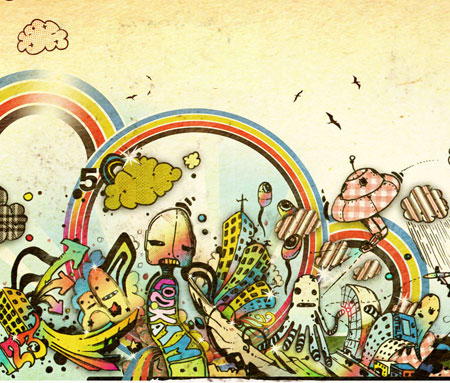
The way in which this image is illustrated makes it easy to visualise it as a mural, rather than a piece of artwork.
I really like the way it has a rustic feel with the tea stained background and the outlines in ink, because it adds more personality and uniqueness into the piece of artwork
The artwork portrays an urban illustration style, with the use of obscure shapes and outlines, but also with the variety of random images conveyed through the image.
The colours used are vibrant, but at the same time are quite soft to fit in with the overall rustic feel.
I can see elements of this image working within my own mural. Mainly focusing on the shapes used within the image. E.g. the way in which the buildings are curved and bent over.
I gives the inpression of an urban feel, therefore links to London, but also with YO! sushi through the colours expressed.
Jon Burgerman
Below an example of their work

Again like the previous image, I tried to find one that I could visualise being another mural.
I like the way the piece is crowded. In terms of it being my own mural and including images from London. It would be an effective way of showing the busy/crowded streets of not only London, but also Japan where YO! sushi originates from.
I really like how they overall art style isn’t neat and is more simple, as uses sketches and doodles done in marker pen. It very childlike and playful, but is still very professional at the same time. It all goes on how it is produced, I feel as though I would be confident enough to create something to this effect, as I’m always doodling.
I also like the way in which the image is rendered using different colours, but also how they are rendered. Some spaces are left white only showing the outlines, however some spaces are completely filled with a specific colour.
This makes the image asymmetric and more abstract, but also a lot more interesting to look at.
Silke Werzinger
Below an example of their work
Because I liked the idea of doodles for my mural, I looked at a few examples of a more advanced type of doodles.
The image that is shown above portrays the illustration through the use of a biro pen. This therefore makes the illustration a lot more personal and adds uniqueness to the image. I also like how you can see every stroke produced by the pen, this shows than it was hand drawn and not photoshoped.
I also like how the background has a paper texture to it, giving the impression the illustration had just been sketched out. Adding to the effect of it just being a simple doodle, but it’s more than that as there has been a lot of thought into how everything should be laid out.
It’s very minimal with hardly any use of colour, but it doesn’t need a lot of colour, as this would distract the eye from the main focus of the illustration.
I do like the overall illustration, however I feel it would need more colour injected into it to fit in with the YO! sushi brand.
Keiichi Tanaami
Below an example of their work
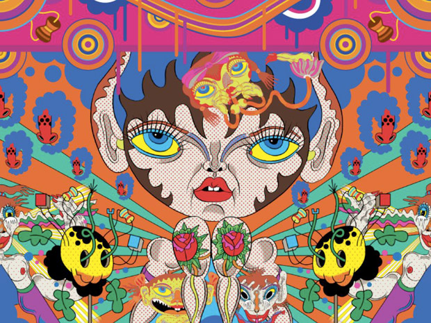
I went back to the more vibrant illustration style, as I feel it would fit in with YO! sushi brand a lot more.
This particular illustration style includes a bit of everything. It has the flat vector style with the bright colours and obscure shapes, which gives the feel of an urban style. However the images themselves look as though they have an Indian influence.
I can also see a Roy Liechtenstein influence as it renders the main image.
All the colours work really well together, even though it is a busy illustration the colours complement each other really well.
The illustration itself is symmetrical, which I’m not a fan of in particularly, but it does work well for what the illustration is trying to achieve.
Overall I don’t really like the neatness of the illustration, I much prefer the ones that aren’t afraid of messing up and the ones that have personality, rather than a perfect vector illustration.
No comments:
Post a Comment