Monday 29 November 2010

direct mail

I couldn't really think of a unique piece of direct mail, i thought of all the obvious solutions, such as a bottle opener and fridge magnet. However i wanted to be more unique and come up with something that none of my other class mates would think of.


I suddenly got the idea from a dream i was having, i woke up and had to write it down before i forgot it. Sounds a bit cheesy but when explaining it to fellow classmates and tutors they sounded impressed by it.


The idea was to send out a flyer type thing through the post, and apon opening inside you would find one chopstick.


This in turn created a direct response as to claim the other chopstick you had to go into YO! sushi, then you can claim a free meal of your choice.


I also added a funny paragraph about the use of one chopstick, being used as a wand, if you wanted to be harry potter, but not good if you wanted to eat at YO! sushi. I did this to keep the quirkiness of the brand.


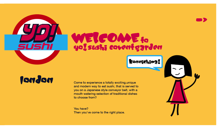
These 2 pages will be side by side, the yellow line on the second page is where the chopstick will go, it will look as though she's holding it.
Again the use of space is present, which i'm a fan of. I personally think this will be an effective way of coaxing people into the restaurant, but it's also a funny way, as the viewer may think they have forgot to put the other chopstick in, until they read the passage.


Friday 12 November 2010

further development for the menu

Like i said previous i was going to use the japanese girl from the mural, within the menu, direct mail etc. The previous menu didn't reflect this, so i did a totally different approach and got my head around the branding project, and rebranding the menu.


This is more unique and shows my design flare on the menu, i also like how it's using the images from the mural, because it keeps it corporate in keeping with it.
I also like the space it has, makes it modern like the company, but also has a fun and young feel about it. which again links in with YO! sushi brand.


This is the inside page, keeping with the London underground from the previous menu, which i still feel works quite well.
It has a nice clean feel and again modern, i really like this it's a complete different approach to the previous menu and will be sticking with this layout.

I will have to keep this clean look throughout my menu, to keep consistency. This shouldn't be a problem as the YO! sushi band is quite modern and minimal, i still want to incorporate this into it.


I feel this are working very nicely and have a nice use of the white space, eventhough there's a lot of type, it doesn't look crowded. It's also balanced in a asymmetric way. I will keep this layout for all the pages.


first idea for menu

Keeping in with the yo sushi type of theme, I slightly altered the menu, keeping the colours the same and fonts the same.


I like the logo incorporating the plate, then once opened logo will then be changed into the London underground logo. The colours alternate to relate the London underground logo, i really like this and will definately be sticking with this idea.


However i have kind of missed the point in re branding the menu and it looks exactly the same as the previous, so i will have to reconsider this.

Wednesday 3 November 2010

The Mural

I have now placed all the images together to create the mural.


This is as finished as the mural is going to be, sketches for this can be found in my development folder. I will take the element of the japanese girl and use it in my direct mail etc.

I feel the colours work really well and fit with the target audience, very vibrant, but also fit in with the YO! sushi brand.