Monday 29 November 2010

direct mail

I couldn't really think of a unique piece of direct mail, i thought of all the obvious solutions, such as a bottle opener and fridge magnet. However i wanted to be more unique and come up with something that none of my other class mates would think of.


I suddenly got the idea from a dream i was having, i woke up and had to write it down before i forgot it. Sounds a bit cheesy but when explaining it to fellow classmates and tutors they sounded impressed by it.


The idea was to send out a flyer type thing through the post, and apon opening inside you would find one chopstick.


This in turn created a direct response as to claim the other chopstick you had to go into YO! sushi, then you can claim a free meal of your choice.


I also added a funny paragraph about the use of one chopstick, being used as a wand, if you wanted to be harry potter, but not good if you wanted to eat at YO! sushi. I did this to keep the quirkiness of the brand.


These 2 pages will be side by side, the yellow line on the second page is where the chopstick will go, it will look as though she's holding it.
Again the use of space is present, which i'm a fan of. I personally think this will be an effective way of coaxing people into the restaurant, but it's also a funny way, as the viewer may think they have forgot to put the other chopstick in, until they read the passage.


Friday 12 November 2010

further development for the menu

Like i said previous i was going to use the japanese girl from the mural, within the menu, direct mail etc. The previous menu didn't reflect this, so i did a totally different approach and got my head around the branding project, and rebranding the menu.


This is more unique and shows my design flare on the menu, i also like how it's using the images from the mural, because it keeps it corporate in keeping with it.
I also like the space it has, makes it modern like the company, but also has a fun and young feel about it. which again links in with YO! sushi brand.


This is the inside page, keeping with the London underground from the previous menu, which i still feel works quite well.
It has a nice clean feel and again modern, i really like this it's a complete different approach to the previous menu and will be sticking with this layout.

I will have to keep this clean look throughout my menu, to keep consistency. This shouldn't be a problem as the YO! sushi band is quite modern and minimal, i still want to incorporate this into it.


I feel this are working very nicely and have a nice use of the white space, eventhough there's a lot of type, it doesn't look crowded. It's also balanced in a asymmetric way. I will keep this layout for all the pages.


first idea for menu

Keeping in with the yo sushi type of theme, I slightly altered the menu, keeping the colours the same and fonts the same.


I like the logo incorporating the plate, then once opened logo will then be changed into the London underground logo. The colours alternate to relate the London underground logo, i really like this and will definately be sticking with this idea.


However i have kind of missed the point in re branding the menu and it looks exactly the same as the previous, so i will have to reconsider this.

Wednesday 3 November 2010

The Mural

I have now placed all the images together to create the mural.


This is as finished as the mural is going to be, sketches for this can be found in my development folder. I will take the element of the japanese girl and use it in my direct mail etc.

I feel the colours work really well and fit with the target audience, very vibrant, but also fit in with the YO! sushi brand.

Tuesday 19 October 2010

Iconic Vectors

I thought now would be the time to add more of my vector images now that i had finished them. I won't be including them all just a few that i like. I've also incorporated the YO! sushi colours to make certain images stand out more and look a bit more quirky.


Great Feedback

After redesigning the original mural, I was in need of some feedback. As I had been staring at my design for too long I had convinced myself that the vector style wouldn't work.
My confidence in the mural had started to slip...

Until I spoke to fellow classmates and tutors and they thought that the style was great and had a uniqueness about it. This greatly boosted my confidence and i decided to stick the vector style.

At the moment I am still playing around with layout, but i'm sure it will be finished within the next week or so.

Tuesday 12 October 2010

New vector

This is the newly developed Japanese girl, she looks more modern and slightly resembles the character used for YO! sushi. At least with this vector there is some sort of link to YO! sushi.


I tried to make the illustration look a little more edgy by not letting the colours stay within the black outlines, as i feel this was the down fall before because it looked to neat.

I've also tried to simplify it as much as i can, i've change the hair so less colour is used, as before the girl had pigtails. I've also got rid of the shoes as i felt this was adding to the childlike effect.

To fit in the YO! sushi brand, i've incorporated the company colours so she looks as though she belongs.

Thinking of how could use her in the mural has to be different to the last example shown. Eventhough i really liked the idea of her being a typical tourist, she will become the main aspect like before and i may fall back into the trap of it looking like something for a storybook.

Therefore i may only be using her once, depending on how the mural looks. I really think she would work on the other aspects such as direct mail, plus other aspects within the YO! sushi restaurant. E.g. On menu's, even toilet doors, so a Japanese boy to accompany her may work also within the mural, it's something i will consider.


I think they work nicely together, i may not use the boy but i now know that if i wanted to, they would work.

Thursday 7 October 2010

My vector images

Below shows my quick try at a vector illustration


As i said before i wanted to relate the action of the person to the landmark, this is what i was trying to achieve here, by making the girl make the time of Big Ben out of her YO! sushi plate and chopsticks.
I feel it works really well and like the meaning behind it, it's like a typical tourist thing going to all the major landmarks.

I will try to do this with most of the imagery i use, but it's highly unlikely i will be able to do it for them all.

Once i have produced a variety of images i will upload them.
The development of the japanese girl will be found in a development folder, demonstrating sketches of how i got to the final result.


Below shows my rough sketch idea produced with all my vector illustrations


This is a first attempt at the mural, i think the images used to depict London work well, however i don't like the style of the japanese girl. It makes it look quite childlike, as if it is for a storybook.
I won't let this put me off i will try different ways of developing it, i may even have to change the look of the girl completely, followed by the mural itself.

Brand Report

After looking at a variety of cities to choose from for my YO! sushi mural, I have decided on the city of London. The reason for this is I feel that London has a lot of well known landmarks around the city, therefore it will be a lot more easier to produce a mural, as I may not have to use every single landmark to show the viewer it is London.
The other reason is I have visited London a few times and feel confident enough on what to
include within my mural, as I have done most of the typical tourist attractions.

Therefore I will create the mural for an opening of YO! sushi that is situated in an area of London, where tourists are present. As I don’t feel confident enough to do a mural for a specific area of London, as I don’t know the areas of London.

As my mural will be for a YO! sushi based in a top tourist spot, the images I intend to include are the stereotypical images of London. Many of these will be in the top list for top of the mind
branding. E.g. Big Ben, London Eye, Tower Bridge. The list goes on.

The issue I have is that many people will be doing London for their own murals, for all the reasons I have mentioned above. However I feel I could make mine stand out from the rest just from the illustration style used.


After looking at a number of artists/ illustrators my YO! sushi mural will be influenced by the 2D
vector style of Petra Stefankova, as the style they has a youthful feel and I feel this would fit in well with the target audience for YO! sushi.
Stefankova’s style also includes a lot of vibrant colours throughout the vector images, this will also fit nicely into the YO! sushi brand because as a whole it is a very colourful company.

The other illustrator I liked the look of was Jon Burgerman, again I liked the colourfulness of his illustrations. Eventhough he produces crude illustrations by hand and not vectors, I like the way in which they overlapped one another and looking quite crowded. I will be taking this aspect from Jon Burgerman. As I feel produced in the correct was on my mural, it will portray London’s busy streets and urban culture.

My mural will almost be like a bird’s eye view looking down onto the River Thames with all the
major landmarks placed appropriately according to where they are situated in London. I will also have a young Japanese girl with her bowl of sushi at these landmarks, doing the typical tourist thing of sight seeing.

She will be doing different actions at each landmark that link in with the landmark. My development folder will enlighten more about this.

Monday 4 October 2010

A rethink into my ideas

I know i had a clear initial idea into how i was going to produce the illustration style and what i was going to include in the mural, however that has now changed after i found an image i really liked and spoke about the brief with my boyfriend.


Firstly this is the image that changed all my thinking 


I found this image by typing in London Illustrations into Google, this piece of art is produce by famous illustrator Petra Stefankova, who specialises in flat 2D vectors. 

Another example of Petra Stefankova work


I feel it would fit in with Jon Burgerman's style ( who i was originally going to be influenced by), because it's quirky and vibrant. These aspects then fit in with YO! sushi as a whole because of the target audience it is aimed at. I will do a similar style to Petra Stefankova and Jon Burgerman mixed together, but make it my own. 

This could easily work for the YO! sushi company, as it combines both London and Toyko together in this illustration. I feel a little under pressure know that i have seen this, to make my own a lot better.
This illustration has also made me feel confident in making my mural vector based now, because after analysing how this illustration is put together most of it is just simple shapes.
I will play around with vector styles as i have never done anything with vectors in it, i'm taking a risk but hopefully it will work.


The next part of my idea change was after talking about my ideas to my boyfriend and he suggested that it might work well if i kept the YO! sushi conveyor belt running through the mural as the River Thames, but then include people eating sushi at the major landmarks around London. As if they had collected there plates of the conveyor belt.

I loved this idea and decided to play around with how i could use this to my advantage.
I didn't want the same image at all the different landmarks, i wanted to relate the action of the person with the sushi, to the landmark.


Wednesday 29 September 2010

Initial thoughts/ideas for the mural

After doing research into the YO! sushi brand, my first initial thoughts came from looking at the way in which the food is served within the restaurants.


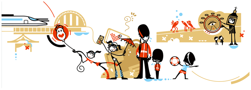
The image shown below shows the plates being served on a conveyor belt


As soon as i looked at this image, something clicked and i instantly saw the shape of the River Thames through the shape of the conveyor belt.
This then left me with a number of possibilities on how this could be used and incorporated into the YO! sushi mural.

I first thought of producing the illustration of this exactly how the image is shown, with the plates going round on it. This would be the River Thames, using blue outlines in marker pen.
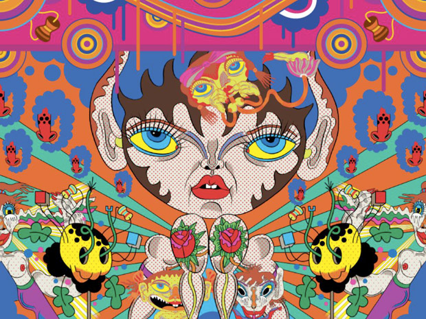
The rest of the mural would represent the map of London, (a little like the beginning of Eastenders when it zooms out) including all the major landmarks tourists would recognise, but all either obscure shaping or a lot bigger than they would be on the map.
e.g. Buckingham Palace may be taller than big ben, as the Queen is what makes London a tourist attraction in my opinion. This is just an example and i may not produce it in this way.


As i liked the idea of the London map, i decided to watch the opening of Eastenders to see exactly how and where the River Thames would fit into my mural in relation to the layout, if i was to do it this way.

The beginning starts zoomed in on the Millennium Dome, then zooms out to show the vast size that London is. This then triggered another thought on how i could make my mural interesting.
Looking at the shape of the Millennium Dome made me think of the plates on the conveyor belt, which then led me to think about how i could replace certain aspects of iconic objects related to London, with things related to YO! sushi.


I already had the River Thames as the conveyor belt, the Millennium Dome as one of the plates. However it may not work with all the chosen images i'm going to use my mural, plus it may get confused with a Japanese theme if i start including Japanese images into the mural, as i have to consider if wether or not the onlooker is familiar with London landmarks.


I will try out my initial ideas though and have a go at sketching out how i have visualised it.
You never know it could work, i'm not dismissing any ideas at this stage. i can only develop them a lot further from where i have started.

Tuesday 28 September 2010

The chosen illustator/illustration style

By looking at a variety of illustrators and illustrations styles it has influenced me to go down the route of creating a doodle style mural for YO! sushi.

This means I can use my own illustration style mixed with that of others that I have analysed. This will give the mural character, but also be aesthetical pleasing to look at.


The illustrators I will be taking influence from for my mural are


Matei Apostolescu and Jon Burgerman


From Matei Apostolescu, I will be incorporating the obscure shapes and random images in some way into my mural.
As I really liked the style and the effect it produced with both these aspects merged together.
It's an urban style which fits in well with the London lifestyle. I can see this as a piece of graffiti art on a wall in London.


From Jon Burgerman, I will be incorporating the doodle style and the crowding of the images into my mural.
As I thought that a doodle style maybe easier to produce, because if by chance I was to make a mistake it could easily be made into something else.
The mural will also incorporate the crowding of London as a city through the crowding of the illustrations. It's a subliminal message that i feel would have a good effect.


I also like the fact that doing the illustration by hand makes it more personal, than a neat vector would. Even though the vector would be produce by me, it wouldn't have the same flare as an illustration would have, as I don’t feel confident enough to produce a vector image.


The mural will obviously be portraying iconic images of London, therefore I will be merging both illustration styles together (not the images from both illustrators) to create something that is unique.

Looking at influential illustrators/artists

I decided to look at a variety of illustrators to influence me into what artistic style I wish to take, and how it would work with the YO! sushi brand.

Below are a few illustrators I liked the look of


Matei Apostolescu


Below an example of their work


The way in which this image is illustrated makes it easy to visualise it as a mural, rather than a piece of artwork.
I really like the way it has a rustic feel with the tea stained background and the outlines in ink, because it adds more personality and uniqueness into the piece of artwork

The artwork portrays an urban illustration style, with the use of obscure shapes and outlines, but also with the variety of random images conveyed through the image.

The colours used are vibrant, but at the same time are quite soft to fit in with the overall rustic feel.

I can see elements of this image working within my own mural. Mainly focusing on the shapes used within the image. E.g. the way in which the buildings are curved and bent over.
I gives the inpression of an urban feel, therefore links to London, but also with YO! sushi through the colours expressed.


Jon Burgerman


Below an example of their work


Again like the previous image, I tried to find one that I could visualise being another mural.
I like the way the piece is crowded. In terms of it being my own mural and including images from London. It would be an effective way of showing the busy/crowded streets of not only London, but also Japan where YO! sushi originates from.

I really like how they overall art style isn’t neat and is more simple, as uses sketches and doodles done in marker pen. It very childlike and playful, but is still very professional at the same time. It all goes on how it is produced, I feel as though I would be confident enough to create something to this effect, as I’m always doodling.

I also like the way in which the image is rendered using different colours, but also how they are rendered. Some spaces are left white only showing the outlines, however some spaces are completely filled with a specific colour.
This makes the image asymmetric and more abstract, but also a lot more interesting to look at.


Silke Werzinger


Below an example of their work


Because I liked the idea of doodles for my mural, I looked at a few examples of a more advanced type of doodles.
The image that is shown above portrays the illustration through the use of a biro pen. This therefore makes the illustration a lot more personal and adds uniqueness to the image. I also like how you can see every stroke produced by the pen, this shows than it was hand drawn and not photoshoped.

I also like how the background has a paper texture to it, giving the impression the illustration had just been sketched out. Adding to the effect of it just being a simple doodle, but it’s more than that as there has been a lot of thought into how everything should be laid out.

It’s very minimal with hardly any use of colour, but it doesn’t need a lot of colour, as this would distract the eye from the main focus of the illustration.

I do like the overall illustration, however I feel it would need more colour injected into it to fit in with the YO! sushi brand.


Keiichi Tanaami


Below an example of their work


I went back to the more vibrant illustration style, as I feel it would fit in with YO! sushi brand a lot more.

This particular illustration style includes a bit of everything. It has the flat vector style with the bright colours and obscure shapes, which gives the feel of an urban style. However the images themselves look as though they have an Indian influence.
I can also see a Roy Liechtenstein influence as it renders the main image.

All the colours work really well together, even though it is a busy illustration the colours complement each other really well.

The illustration itself is symmetrical, which I’m not a fan of in particularly, but it does work well for what the illustration is trying to achieve.

Overall I don’t really like the neatness of the illustration, I much prefer the ones that aren’t afraid of messing up and the ones that have personality, rather than a perfect vector illustration.

Thinking about an art/illustration style

Now that I have a city in mind, my next step is to decide on what illustration/art style I will be using for the YO! sushi mural. I want it to not only reflect YO! sushi as a brand, but also fit in with the lifestyle and culture of the city of London.

When I think of London as a whole, the type of style that comes to mind is a grungy, graffiti approach. This is because of the urban lifestyle of many of the Londoners. It also comes down to the graffiti portrayed throughout the streets and underground.
However I wouldn’t feel confident enough to use this type of style, as I haven’t had any experience in graffiti art. On the other hand I could take certain elements from the graffiti style, such as the bright colours and flat style vector shapes.

Produced in a slightly different way these aspects I have mentioned could have potential to work, as YO! sushi as a whole is portrayed using bright colours and some flat vectors throughout there menu’s.

Monday 27 September 2010

London's famous landmarks etc

Now that I have chosen London as my city for the YO! sushi mural, my next step is to look into what aspects are most related to London, in other words look at the most popular tourist attractions associated with London. By doing so will give me a list of what things to include within my mural.

When typing London into Google these were the first items listed:

London Eye
Tower of London
Tower Bridge
Buckingham Palace
Big Ben


I’ll count these as top of the mind branding from Google, however there are a lot more things that could be added to that list including :

London Underground
River Thames
Houses of Parliament
St Paul’s Cathedral
Gherkin
Trafalgar Square
Queens Guards
Harrods
Red bus


The list goes on for what I could say is associated with London, but in my opinion, these are the most common landmarks etc, that people would say if they were asked to name something to do with London.


Some other aspects of London that could be added to the list are:


The Queen
Corgi's
British Flag
Pound Sterling


However i could go down a completely different route and not use images at all, but typography expressing the London lifestyle, either through famous street signs or well known songs from London etc. Done typographical could look really interesting, i will not dismiss this idea as it could work in some way through the mural.

I’m not sure wether I’ll be using all of the items from both lists, it all depends on what art style I pick. However if the art style were quite crowded then it would work really well, but if not I will pick the items off the list that I personally feel express the city of London the best.


Choosing a city for the mural

After looking at YO! sushi as a brand, I decided to look into what capital cities would be interesting to use for my mural.

This list shows the possible cities to use:

Amsterdam
Berlin
Lisbon
London
Moscow
New York
Paris
Reykjavik
Rome
Tokyo
Venice

The cities that jump out at me are

London
New York
Paris

These cities stood out the most to me because I feel confident enough about what famous landmarks/objects are related to each city and they are probably out of all of the cities listed,
the easiest to illustrate for the mural.

However my chosen city out of the three is London, because I’ve visited London a few times and done most of the typical tourist attractions. So by knowing what they are, makes it easier to incorporate the most notorious ones within the YO! sushi mural. Therefore  the onlooker will instantly be aware what city is portrayed through the mural.

Research into the YO! sushi brand

To get in insight into what YO! sushi is all about i did some research into the company as a whole, focusing on their main aspects of branding.

 Below is the current logo for the YO! sushi brand


 Just by looking at the logo for YO! Sushi sets the style choice for what the mural may need to look like. As it’s really bright, vibrant and modern, I’m thinking of incorporating the brightness into the mural, so it looks as though it belongs to the YO! Sushi brand.


The colours from the logo also follow through to the interior of the YO! Sushi restaurant. (as you can see from the image above) Which in turn reinforces the brand, but also keeps the corporate feel of the company throughout all aspects of their identity.


I also decided to look at how the food is served, as it isn’t the traditional way of being served in a typical posh restaurant. It’s self service, where in which you choose what you want to eat from the coloured plates that come around on a conveyer belt.

This in itself makes the whole YO! sushi brand unique and memorable, because it has a more hands on approach to how to choose what courses you want to eat. It also makes it more fun and interactive because the plates are different colours, therefore you wait for your chance to take the coloured plate of your choice when it comes round on the conveyer belt.


The bill for the food eaten runs a unique system. Each plate is colour coded to determine the price of each plate. The numbers of plates used by the customer are then totalled to create the bill.


These specific plates also portray the brands corporate colours, however they do include other colours as they have a large menu. So four different colours couldn’t cater for all the item groups on the menu.

I personally think this sort of dining is the way forward, it’s ultra modern and is exciting experience at the same time.
Therefore what ever I produce for my mural has to reflect all the aspects I have just mentioned, so it fits in with the dining experience and the uniqueness of the YO! Sushi brand.

Because the project is to produce a mural for YO! Sushi, I decided to see if there were any existing ones already done for them.


This mural clearly demonstrates the Japanese culture, through the use of colours and iconic objects associated with Japan.
I personally like the photography they have used and the way they have made the large cat more dynamic, by depicting it upside down. This is to create a focus point because the eye is instantly drawn to it.

However I feel that it could have been a lot more creative and artistic, rather than a montage of images relating to Japan, because YO! sushi as a brand is really trendy and modern. The mural should reflect this though a style, but it doesn’t it just uses a collage of images that could be used on a mural for any Japanese sushi bar.

An insight into the YO! sushi brief

I am a second year Foundation Degree Graphic Design student and I have been set the task of producing a mural for a YO! sushi restaurant, which has to include iconic images from a major city of my choice ( that I haven't decided on yet ) influenced by the style of a famous artist/illustrator.
The mural has to relate to the target audience of 18-25yr olds. Therefore the mural needs to reflect this, but also to fit in with the trendy and unique brand that is YO! sushi.

This then expands onto designing a direct mail pack to promote the opening of the laster YO! sushi restaurant, a branded menu and wine/beer label.
These then may or may not include part of the mural on the design, depending on the layout.